2024 - 2026 Mobile App Automotive Community

Real-time map and community app
for car people. 380K users,
$20 spent on ads.

I joined an existing startup to help grow something that was already alive — and learned more about product, business, and failure than any greenfield project could teach me.

Details
Product
Mobile (iOS / Android)
My roles
UI/UX Designer Product Manager Illustrator Manual QA
Team
Founder (Yiorgos) 2x Mobile Dev Backend Dev Community Manager
Stack
Figma Tokens Studio Adobe Illustrator Jira Confluence Discord

In a nutshell

0a

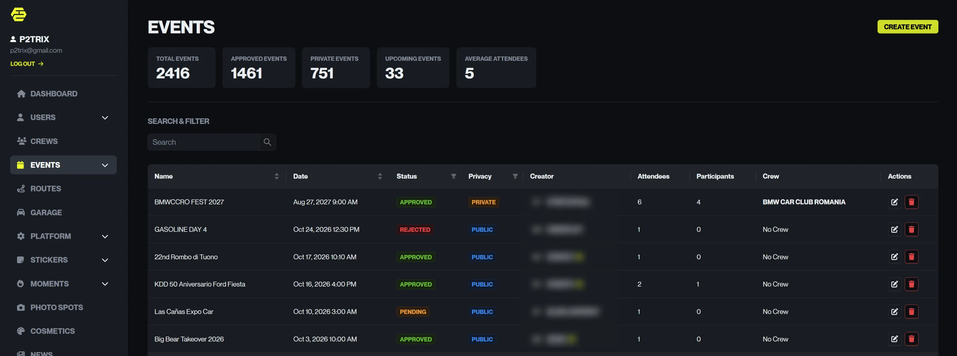
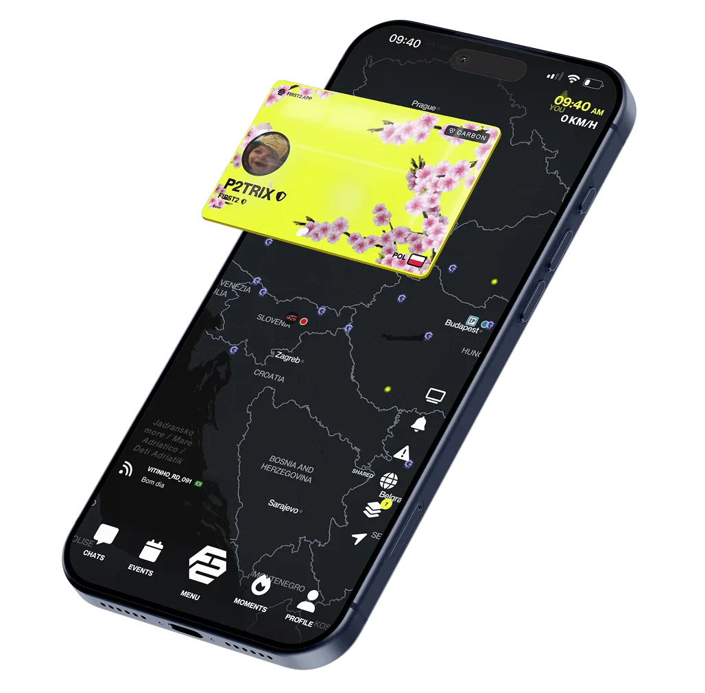
First2 was a vertical superapp for automotive enthusiasts — a real-time map where car people could share their location, discover events and meets, build crews, and show off their builds. Think of it as the missing layer between Google Maps and car culture: utility first, community underneath.

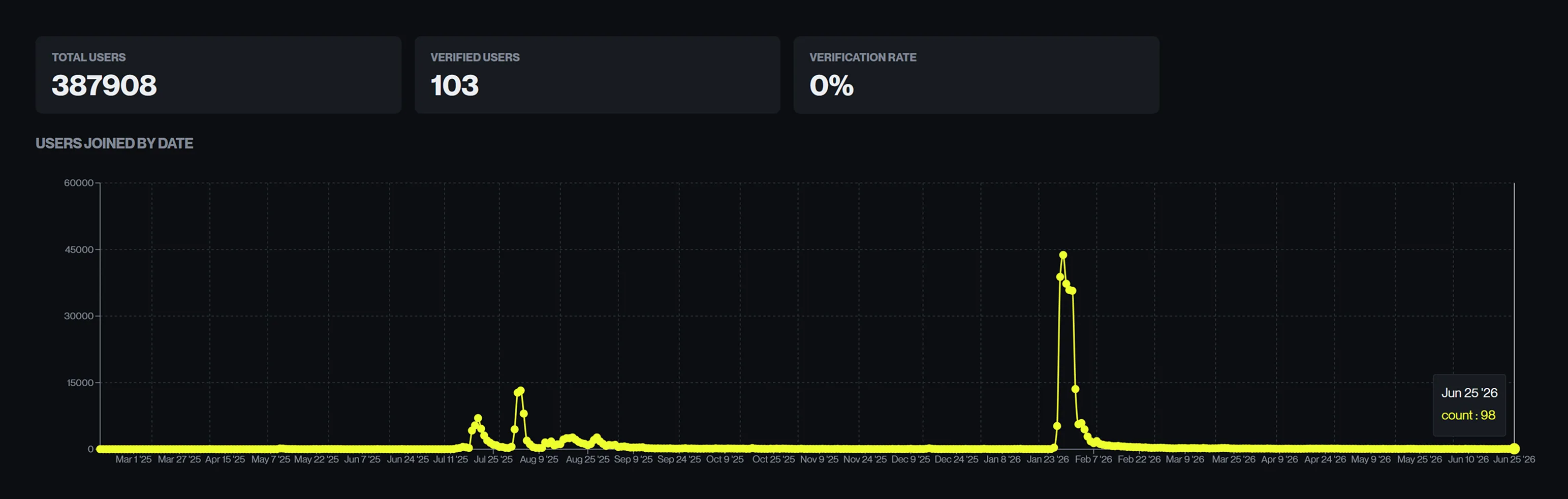
I joined through a friend when the app had around 40–50K registered users. By the time we wrapped up, that number was sitting at 380K — acquired almost entirely through organic growth and a single viral moment when we launched the map feature. Total ad spend across the project's lifetime: $20.

My role

0b

My responsibilities were fluid by design. I was brought in as a UI/UX designer but quickly absorbed product management, illustration, moderation, and QA into the day-to-day. In a bootstrapped team where everyone worked for free and wore multiple hats, that was just the reality of the job.

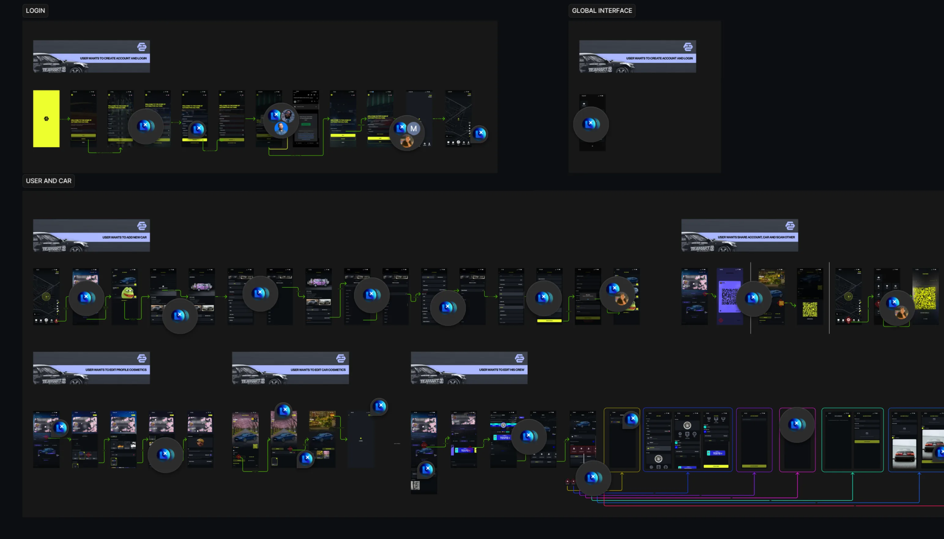
On the design side: auditing and rebuilding the existing interface, creating a design system from scratch, illustrating cosmetic items for the in-app store, and designing the onboarding flow. On the PM side: running Jira, writing tickets, breaking down features into flows, prioritising the backlog — often based directly on what the community was asking for on Discord.

Kiril Krsteski
Kiril Krsteski
Founder,
Lead Engineer
SVN
Yiorgos Pinis
Yiorgos Pinis
DevOps &
Infrastructure
GR
Rusnė Šiuopytė
Rusnė Šiuopytė
Public Relations,
Funding
LT
Patryk Wenda
Patryk Wenda
Product Design,
Project Management
POL
Mateusz Spychaj
Mateusz Spychaj
Senior Engineer,
DevOps
POL
Pedro Lima Faria
Pedro Lima Faria
React Native
Developer
PT
1

Research

UX Audit Community Feedback Competitor Analysis

2

Define

Business Model User Segments Priorities

3

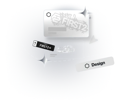
Design

Design System Onboarding Cosmetics & Illustrations

4

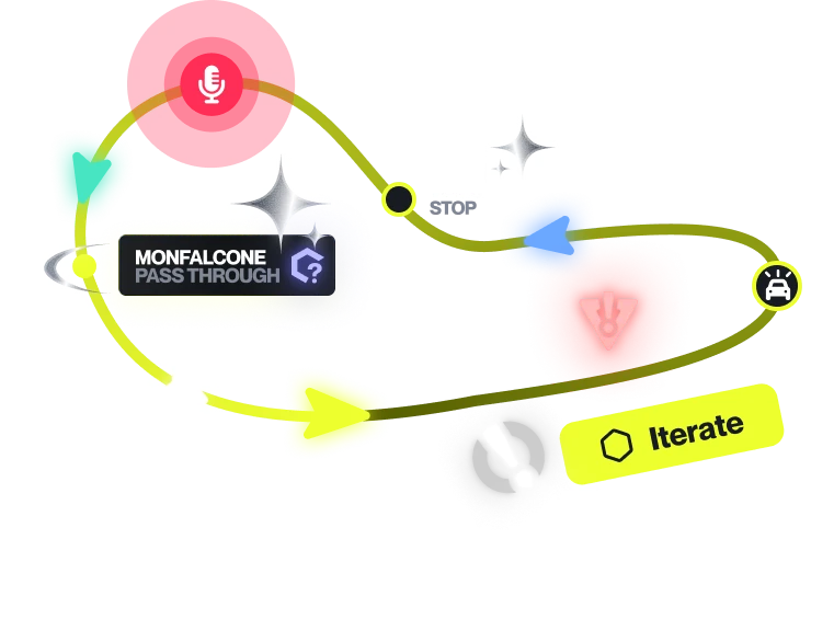
Iterate

Audit Findings Edge Cases Feature Work

1

Research

UX/UI Audit · Community Feedback · Competitor Analysis

What I walked into

1a

The app existed and it worked — but it was held together with intent rather than system. Every new feature had been built in isolation: no shared components, no style guide, no token structure. Each screen reinvented the wheel. It was a proof of concept that had outgrown itself.

My first move was a full UX audit of the existing product. I documented inconsistencies across spacing, type hierarchy, button sizing, error states, empty states, and navigation patterns — and there were a lot of them. Paddings differed screen to screen. System-default modals were used throughout. Visual hierarchy was either absent or inverted. Onboarding didn't exist.

The problem worth solving

1b

Car culture has always run on trust — but the tools people use don't reflect that. You're buying a used car from a stranger with no shared history. You're taking your build to a garage recommended by Google reviews that may or may not have been paid for. There's no layer that tells you whether this person is actually part of the scene, whether they know what they're talking about, whether anyone who shares your obsession has vouched for them.

The car community exists — it's massive, passionate, and global — but it's scattered across Facebook groups, subreddits, Instagram profiles, and WhatsApp threads. None of those platforms were built for it. The algorithms don't care about car culture; they care about keeping you scrolling.

First2 was meant to fix that. A shared space where reputation is built by real people from the same scene — not star ratings gamed by bots, but social proof that comes from actually showing up: to meets, to routes, to the community. The kind of trust that forms naturally when you're all into the same thing, and everyone knows it.

UX problems I found

1c

Two issues dominated everything else.

First: visual hierarchy. The interface didn't communicate importance. Headers were smaller than the content beneath them. Cards had inconsistent spacing. Actions were buried. The app looked like a series of individual decisions rather than a single designed system.

Second: onboarding didn't exist. Users arrived with no guidance. The map had gone viral — largely, we suspected, through TikTok — and people landed in the app without understanding what it was for or what to do next. High installs, poor retention. The product couldn't explain itself.

These two problems were connected. An app without visual clarity can't teach itself to a new user.

To validate this, I ran usability testing with a handful of users who had never seen First2 before. I asked them to perform basic tasks: sign up, find a meet, set their Safehouse. The results confirmed our suspicion — users could complete tasks, but they relied on trial and error, not intuition. The interface wasn't guiding them; it was just in their way less than they expected.

That distinction matters. A usable interface that requires effort to learn isn't the same as one that communicates intent at every step. The fixes that came out of those sessions — clearer labels, visual hierarchy in forms, contextual help on first visit — fed directly into the design system work and the onboarding redesign.
2

Define

Business Model · User Segments · Priorities

Who is this for

2a

The user base was more diverse than it first appeared. At its core: automotive enthusiasts who wanted a shared map layer for their scene — drives, meets, parking spots, routes. But within that, you had meaningfully different segments: daily drivers who wanted social features, car builders invested in their builds and looking for community, and event organisers running meets and tours.

There was also a B2B layer in development: local garages, detailers, and shops who wanted to reach car-focused customers in their area. The pitch was essentially: come for the map, stay for the marketplace.

Making it sustainable

2b

The first thing I thought about when I joined wasn't onboarding or visual consistency — it was monetisation. An app with 40K users and near-zero revenue is a ticking clock.

The model we had was: Carbon subscription at €4.99/month, and a virtual currency (CRED) for purchasing cosmetic items. I pushed for expanding the cosmetics system — stickers, badges, profile customisation — because it was the clearest path to revenue that didn't require a large team or new infrastructure. Let users express their car identity, charge them for it.

The uncomfortable numbers

2c

What the data made clear: user ≠ revenue. Conversion to paid was under 1%. 380K registrations sounds impressive; 119 paying subscribers is harder to defend.

The underlying problem wasn't the product — it was that the foundation hadn't been properly thought through before I arrived. No real discovery phase. No validated user segments. No answer to the question of how you retain users on a map-based app when you don't have the content budget to keep the map alive. Some of the core costs — maps, location services, app infrastructure — scale with usage. Growth without monetisation isn't traction, it's a timer.

3

Design

Design System · Onboarding · Cosmetics · Illustrations

Building the system

3a

Before designing new features, I needed to create the foundation that should have existed from day one. I built a design system using Figma with Tokens Studio: core primitives, semantic aliases, component tokens. Neue Montreal as the primary typeface, 4px base spacing, 24px default border radius. Atomic structure — atoms, molecules, organisms — documented in Confluence.

The goal wasn't to redesign everything at once. It was to establish a reference point so that the next feature built would be consistent with everything before it, and the eventual visual consolidation of the vibecoded legacy screens would have somewhere to converge.

Onboarding

3b

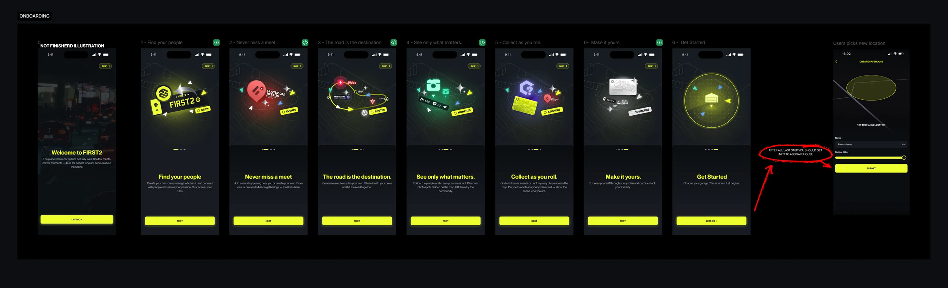
The onboarding I designed had one job: make the user understand what First2 is and anchor them to it before they leave.

The flow introduced the core features with visual callouts showing where to find them in the actual interface — not abstract marketing slides, but real screens. It then immediately prompted the user to add their Safehouse: a personal garage location that makes them invisible on the map. Private by default, visible by choice.

That second step was deliberate. Getting someone to set up their Safehouse meant they'd done something personal with the app. They'd claimed a piece of it. That's the action that converts a tourist into a user.

Cosmetics and illustration

3c

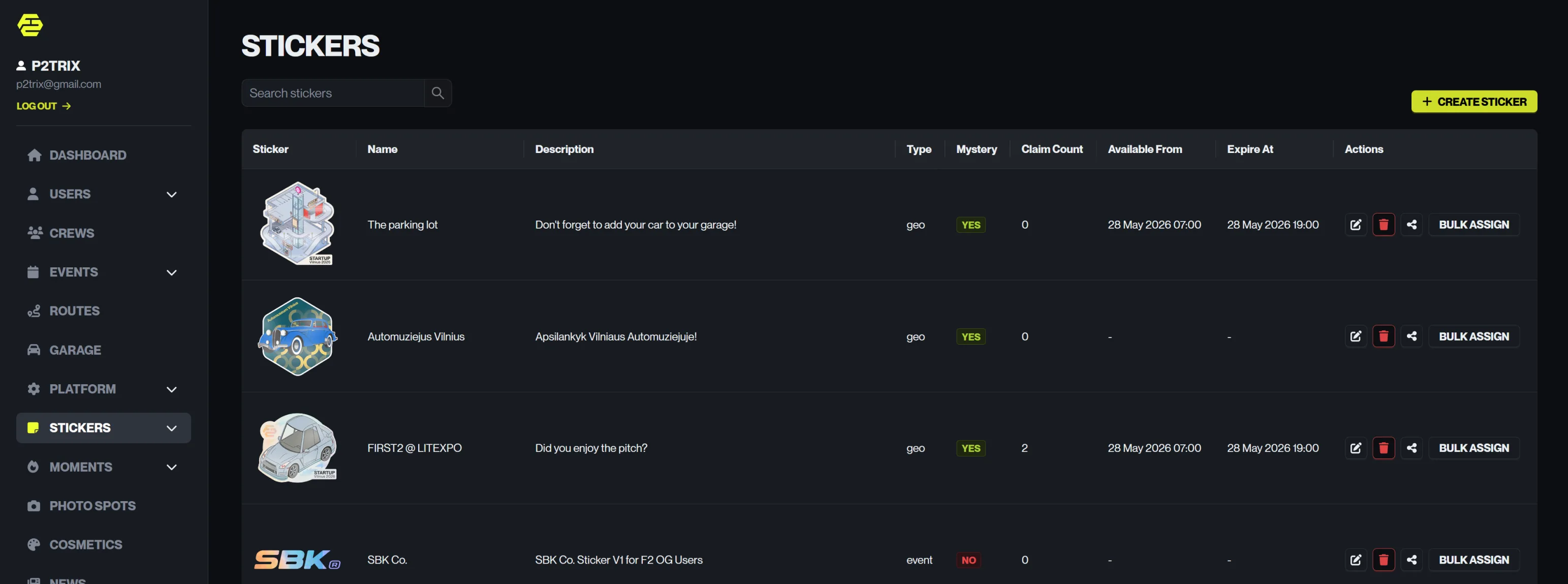

A significant chunk of my work was creating the cosmetic items sold in the in-app store — stickers, badges, profile elements. These weren't just decoration. They were the primary monetisation mechanic and the way users expressed their car identity within the platform.

I handled the full pipeline: concept, illustration in Adobe Illustrator, naming and copy in First2's brand voice (terse, car-culture native, no fluff). The cosmetics system also required UI design for the store itself — item display, CRED economy presentation, and the profile customisation layer.

4

Iterate

Audit Findings · Edge Cases · Feature Work

What the audit found

4a

The Figma audit surfaced a long backlog of issues that ranged from quick wins to structural problems. Recurring themes: inconsistent padding and safe area handling across screens, default OS modals used throughout (a particular pain point for visual consistency), empty states with no illustration or call to action, buttons at non-standard heights, and type hierarchies that worked against the user's ability to scan.

Most of these weren't individual bugs — they were symptoms of building without a system. You can't fix them one by one; you need the system in place first, then work through the screens methodically.

Shipping under constraints

4b

Every design decision had to account for a small dev team working in their spare time. That changed how I approached iteration. I separated changes into: things that could be fixed globally with a single token update, things that needed per-screen attention, and things that required architectural changes and had to be parked.

I also did manual QA — not writing test cases, but hands-on testing of each release. Visual regression, interaction flows, edge cases. With no dedicated QA resource, this was the safety net.

Startup World Cup

4c

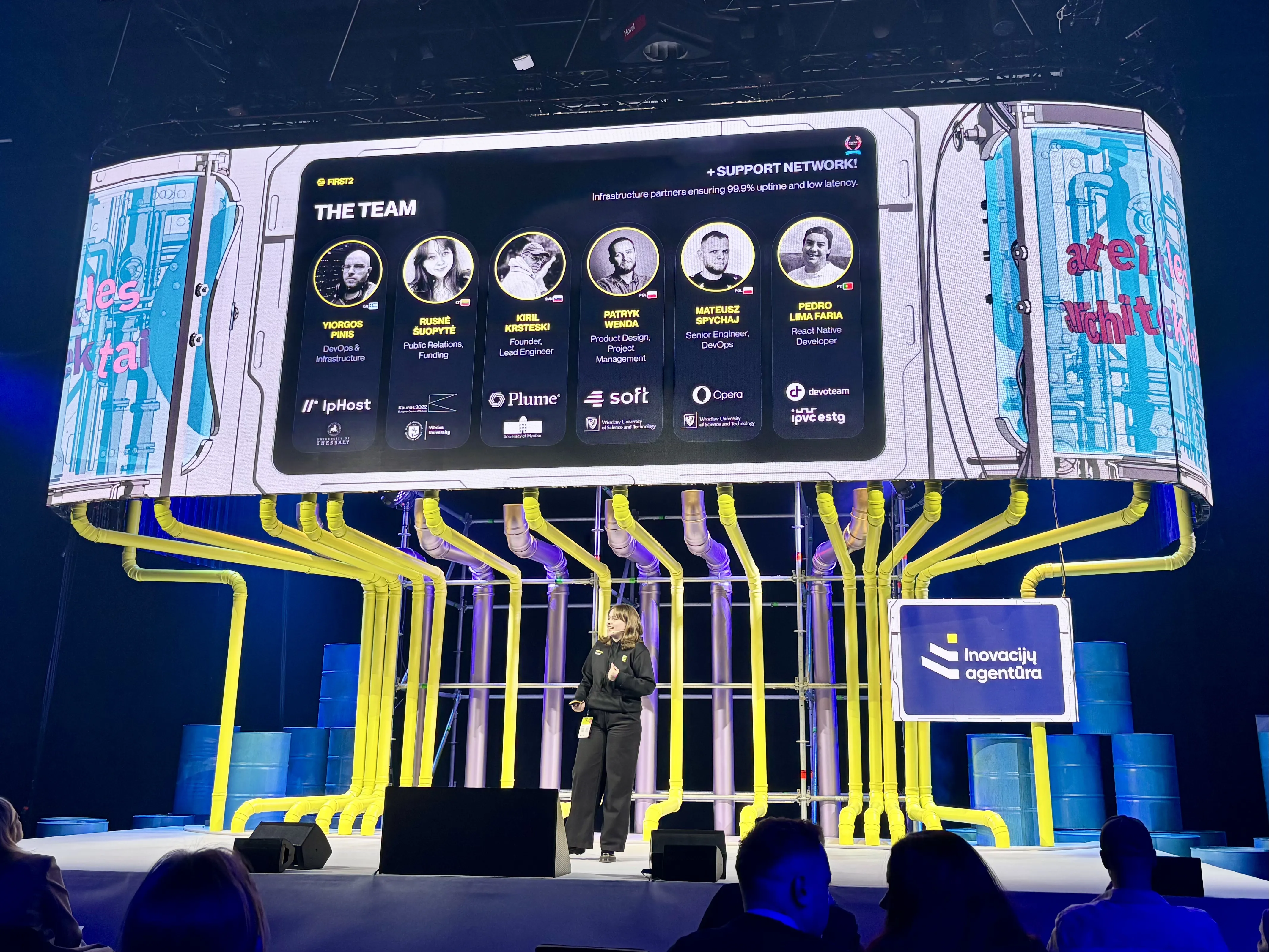
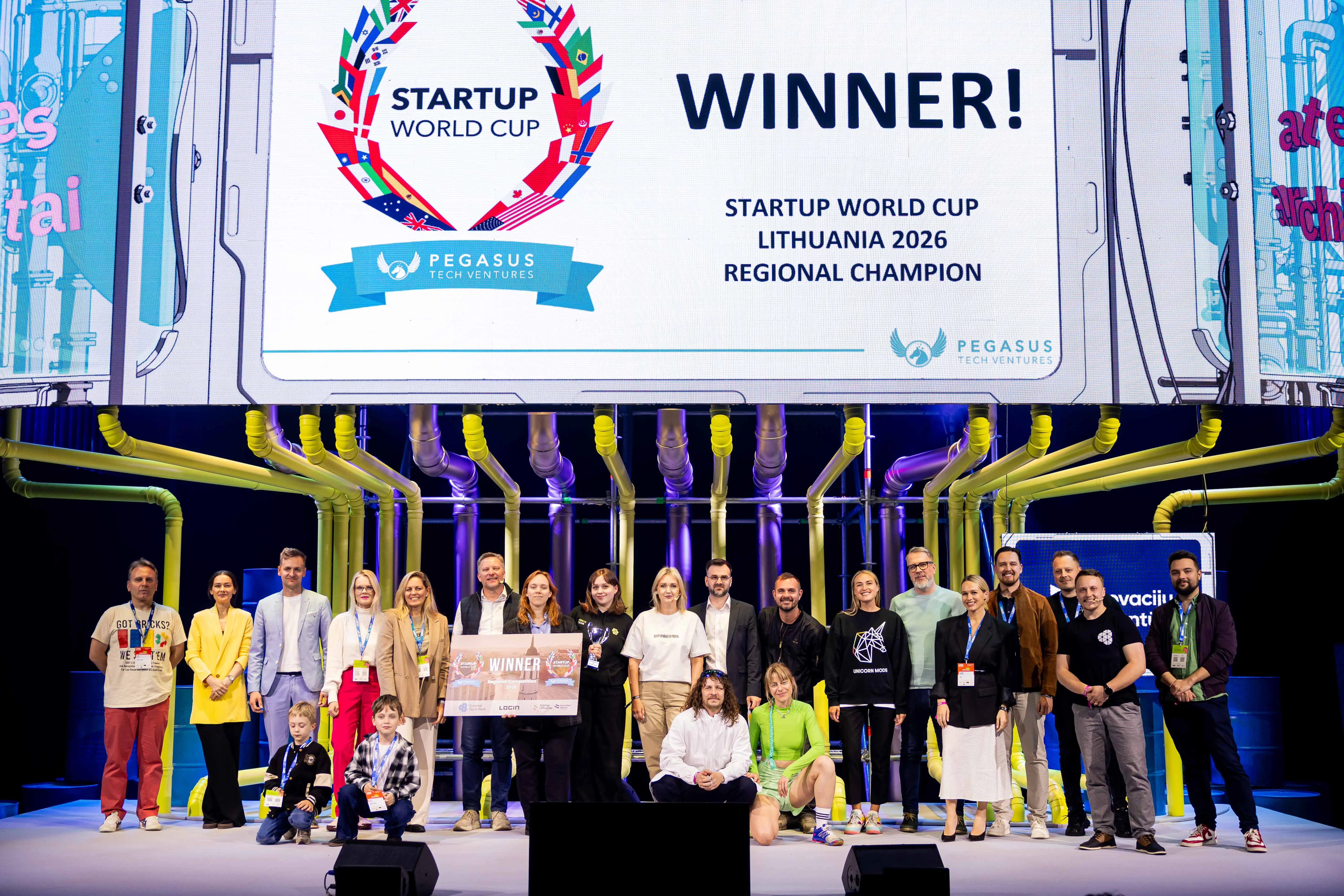
Alongside this I was involved in the pitch deck preparation and investor conversations. We also competed at the Startup World Cup regional in Lithuania (Login Delfi 2026) which sharpened how we framed the business case.

The feature that almost made sense

4d

One of the more interesting challenges was the Route Generator — a feature that let users create and share driving routes. The obvious iteration was adding photo spots, sticker placement along routes, and eventually building toward a gamified collect-them-all mechanic. The community wanted it. The team wanted to build it.

The problem was content. A map feature lives or dies on how much useful data it contains. Generating that content at scale — spots, routes, verified locations — requires either a large active community contributing it, or budget for data licensing. We had a passionate community but not the mass needed to fill a map. And the data costs were out of reach without funding.

This was the pattern that repeated. Good ideas that ran into the same wall: you need money to scale the infrastructure, and you need scale to justify the money.

What I took from this

5a

First2 taught me what a growth trap looks like from the inside. The map went viral, the numbers looked good on a slide, and underneath it the fundamentals were shaky from the start. No proper discovery, no validated monetisation, no content strategy that could sustain a map-based product at scale.

The failure wasn't in the execution — it was in the foundation, built before I arrived. What I learned from that is that product work starts with asking uncomfortable questions early, not designing around the answers you wish you had.

On the craft side: building a design system into an existing product with live users and a backlog of features is a different discipline than building one greenfield. You're negotiating between what should exist and what does exist, while shipping in parallel. That's a skill I didn't have before this, and now I do.

380K users. App shutting down July 2026.

Sometimes the most honest thing in a portfolio is a project that didn't work — and what it cost you to understand why.

01

Viral growth doesn't fix a broken foundation. User numbers can hide the absence of product-market fit.

02

Ask uncomfortable questions early. The cost of avoiding them compounds faster than any metric.

03

Design systems in live products require negotiating between what should exist and what does exist.

04

The most honest portfolio shows what you learned from failure — not just what you shipped.

Let's create something
amazing together

Have a project in mind? I'm always open to discussing new opportunities, collaborations, or just to say hello.